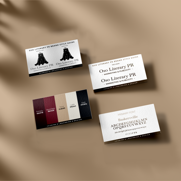
I was thrilled to take on the project of creating a custom illustrated logo for Oso Literary PR. With a passion for vintage aesthetics and a love for storytelling, I set out to craft a logo that would capture the essence of literary promotion while embodying the charm of classic linograph style.
After sketching out various concepts and ideas, we settled on an image of a bear with books balanced precariously on its head. This symbolized both the strength and intellectual prowess that Oso Literary PR sought to convey.
Utilizing vector design techniques, I meticulously brought my illustrated concept to life, ensuring that every line and curve reflected the timeless appeal I aimed for. The process required attention to detail as well as creative problem-solving, but seeing the final product come together was incredibly rewarding.
The vintage linograph style added depth and character to the logo, while evoking a sense of nostalgia that resonated with Oso Literary PR's target audience. In the end, this project allowed me to combine my passion for illustration with my expertise in design to produce a unique and impactful visual representation for Oso Literary PR.

