I decided to start learning UI/UX last year and I never imagined I would get this far so quickly.
I woke up 2 hours earlier than I usually would every single day to study and absorb all the knowledge I could. I'm not one to dip my toes in the water, I jump in headfirst.
The first step on my UI/UX journey? A case study.
When I approached the idea of creating my first UI/UX case study, I knew it had to be something that I resonate with, an app that I could see myself and others using day-to-day but is currently lacking in the product space.
Fast fashion is out, and thrifting is in, but what if you don't have thrift stores in your area? What if you want to thrift high-quality clothes from credible sellers from the comfort of your own home?
And with so many pairing down their wardrobe to embrace a more sustainable lifestyle, the need for an easy way to sell un-needed clothes is ever present. What if we combined both of these needs into one?
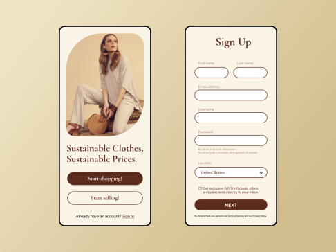
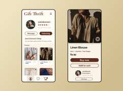
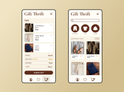
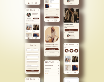
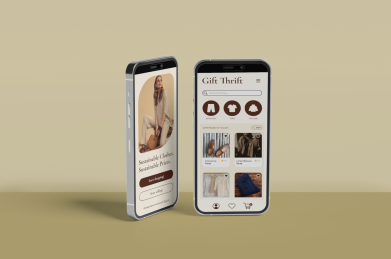
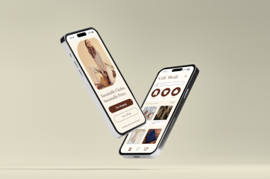
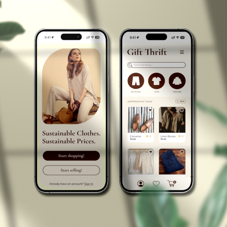
That's where Gift Thrift was born. A useable, user-friendly shopping app in a modern cottage-core style made for the thrift shopper and the closet cleaner alike.
Key Takeaways:
• Easy on the eyes: I used warm tans and soft browns to make the user-experience pleasant and prevent eye-fatigue over time. No one wants to stare at a stark white screen for hours.
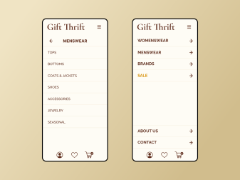
• Everything within easy reach: All of the most important buttons and navigation is placed strategically within easy reach of your thumbs while using the app.
• Individual shops: When you find a seller in your size and style, you can buy many of their items. It's like a style collection curated perfectly to your style.
• Emphasis on spacing and font size: Everything is equally spaced with generous padding to allow for an easy user experience. You need to know where to look, so the most important headings are prioritized in bigger font sizes and bolded.
The goals:
• Intuitive UI interface
• Easy-to-use navigation
• User and seller friendly navigation
Bundling this all in one app design was a hard feat. I spent many early mornings and late nights refining the designs, sending them to everyone I know to get user feedback, going back to the drawing board when it wasn't good enough.
Seeing Gift Thrift transform as my skills improved was an amazing process. This project not only challenged my skills, but my perseverance. When I felt like the page I was working on was good enough; I kept going. I can improve it just a bit more.
Looking back on my UI/UX journey so far, I'm proud of how far I've come, and excited for how far I'm yet to go.
2024 is the year of learning, persevering, and excelling.
