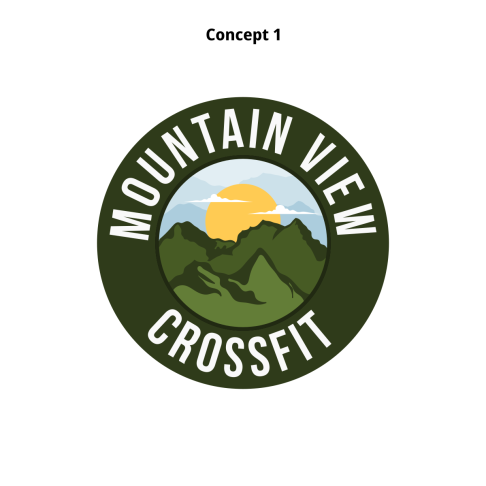
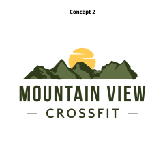
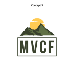
As a graphic designer, I had the opportunity to create a custom illustrated logo design for Mountain View Crossfit, and I wanted to ensure that every detail was meticulously crafted. Using vector design techniques, I carefully sketched out the rugged silhouette of the Canadian Rockies, capturing the majestic beauty of their local area.
The sharp peaks and valleys were meticulously formed with precise lines and curves to evoke a sense of strength and resilience, reflecting the ethos of Crossfit training. The choice to illustrate this natural wonder was deliberate; it not only pays homage to their location but also serves as a powerful symbol of overcoming challenges.
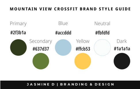
Through this logo design, I aimed to capture the spirit of Mountain View Crossfit – an unyielding determination fueled by passion and community. The use of bold colors and clean lines in the illustration conveys a sense of dynamism and energy while maintaining a timeless aesthetic.
The logo embodies both strength and grace, echoing the core values of discipline, perseverance, and wellness that lie at the heart of Mountain View Crossfit's philosophy. Creating this custom illustrated logo was not just about fulfilling a client's request; it was about distilling their identity into an image that would resonate with their members and stand as a visual representation of their commitment to excellence in fitness.
